Blackboard
Graphic Design + UI (Web & Mobile) + UX Research
About the Project:
This is a quick user interface (UI) exercise, based on the educational technology web platform known as Blackboard. Designs were based on the current website, collected user feedback from teachers and students, and personal experience. Below are conceptual website redesign concepts along with a possible future Mobile App concept.
My Role:
This project was a exercise that was self-motivated due to my frustrations using this platform during college. I personally noticed a lot of teacher to student disconnect even thought the tool is suppose to help users have a more seamless online learning experience. I took it upon myself to create new user friendly and customizable interfaces.
Discovery Process
During the first phase, the goal was to familiarize myself with the Blackboard platform and homepage interface. Coincidentally, I had used Blackboard during my college career, so I was already mostly familiar with the tool as a student user. For this exercise, I began to make notations of things I noticed after careful examination of the site. I took a detailed look at the interface’s terminology and iconography. Turns out many of the terminology was unclear as to what they were designed to accomplish. Still within the discovery phase, I asked close friends (Blackboard users) about their experiences with the tool and acquired some initial user feedback before moving onto the ideation and concept development phases.
User Feedback & Preliminary Mock Up
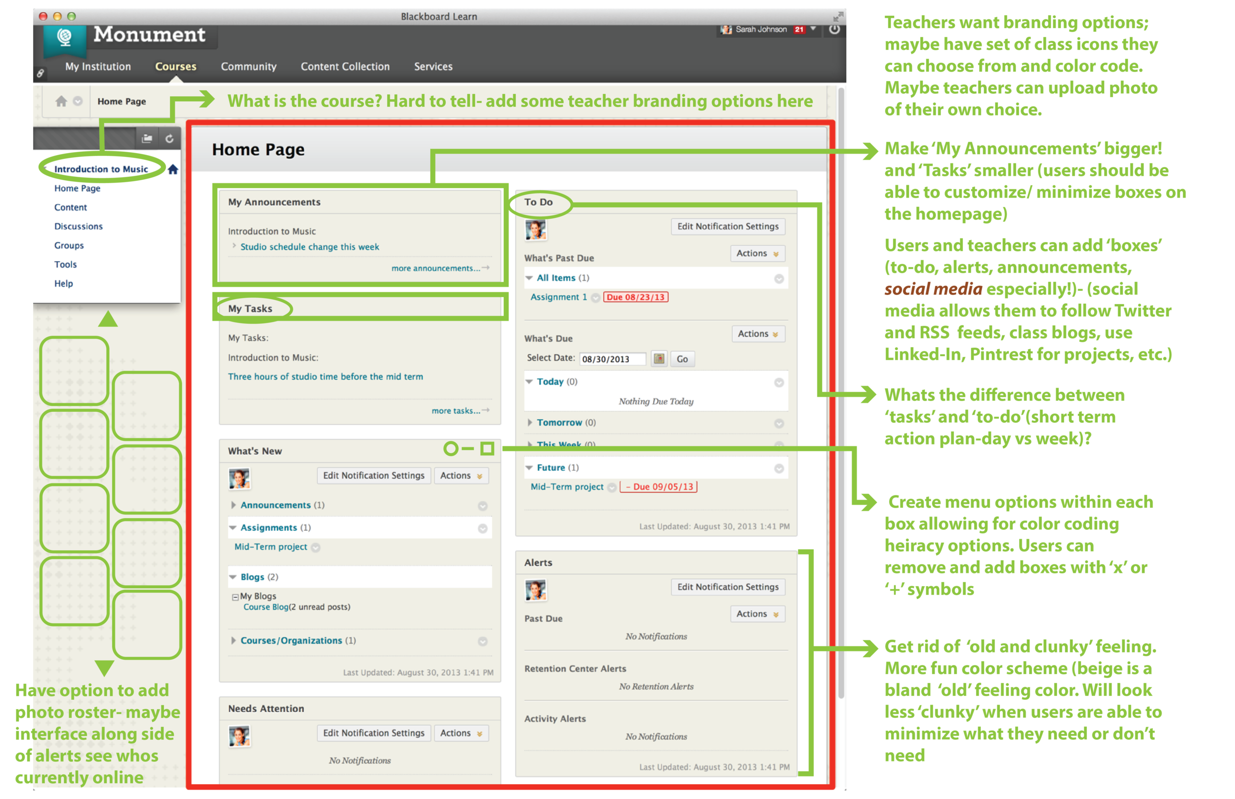
Collecting user feedback for an existing product is a very important process when redesigning a tool. Discovering and organizing ‘pain points’ or tasks that cause the user confusion or ‘pain’ when trying to accomplish the task at hand. As a researcher, collecting a variety of direct user quotes and excerpts can help make a case as to what part of the tool needs to be focused on first to change. . . depending on the severity of the pain point.
“What is the difference between the ‘To Do’ box and the ‘My Tasks’ box?”
“Uploading class content is more complicated than it should be.”
“Class content placement is not consistent between my classes. One professor puts all of our assignments within the ‘assignment folder’ and others put assignments in ‘course content folders’.”
Inspiration
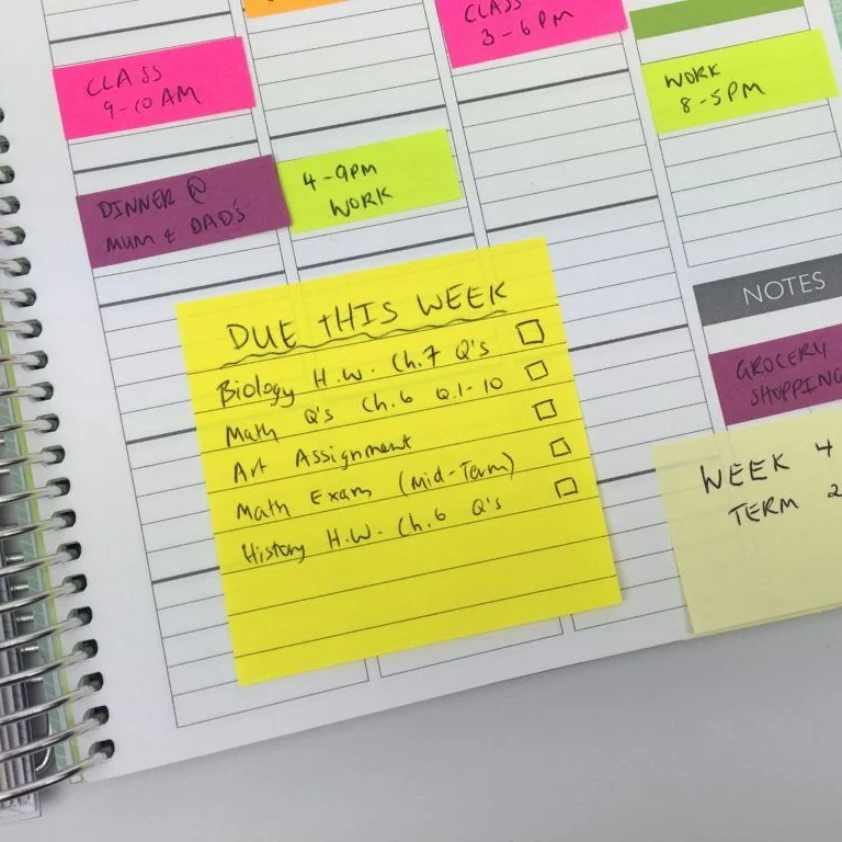
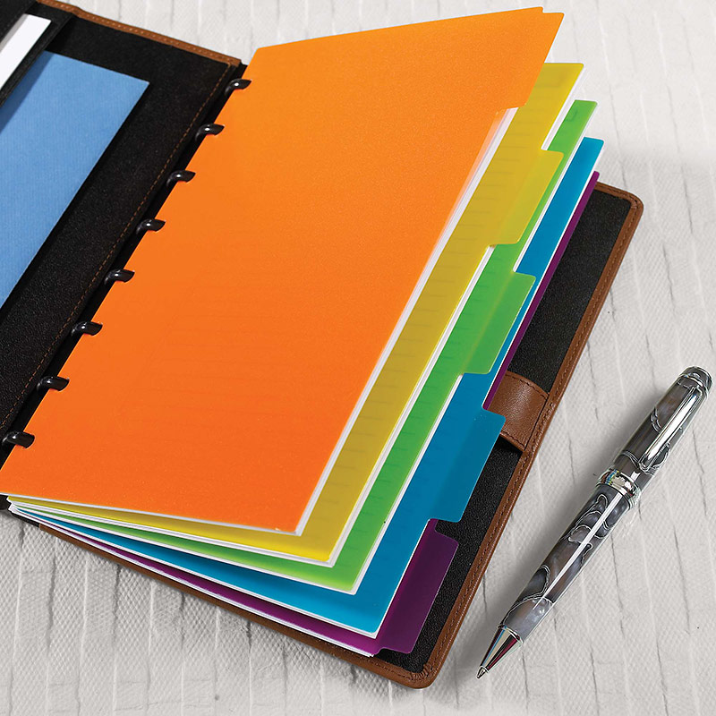
After hearing user feedback, I began brainstorming the ways I stayed organized when I was in school. My concepts below were inspired by basic school supplies such as post-it note to-do lists (concept 01) and notebooks with dividers (concept 02). Using these tools throughout my time in school for various classes to help me stay organized and on task with my assignments.
Concept Development
After collecting and prioritizing user feedback suggestions and pain points, overall both students and teachers wanted the ability to customize their class homepage. Students also wanted the ability to message other students in the course to clarify an assignment or work on a group project. Concept 01 is the ‘post-it’ note concept where users can customize their post-its with color and using a ‘drag-and-drop’ feature to move around their ‘post-it’ notes. Concept 02 is the ‘notebook divider’ concept where users (both students and teachers) to easily jump between their various classes as if it was a real tabbed notebook. Both concepts have two ways of incorporating the collaborative group chat feature that the users had asked for.


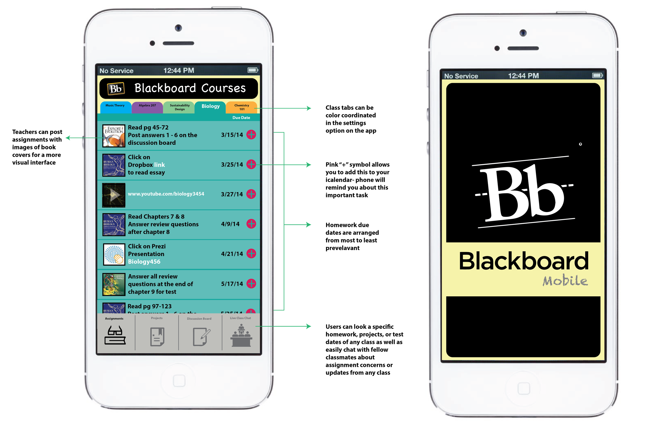
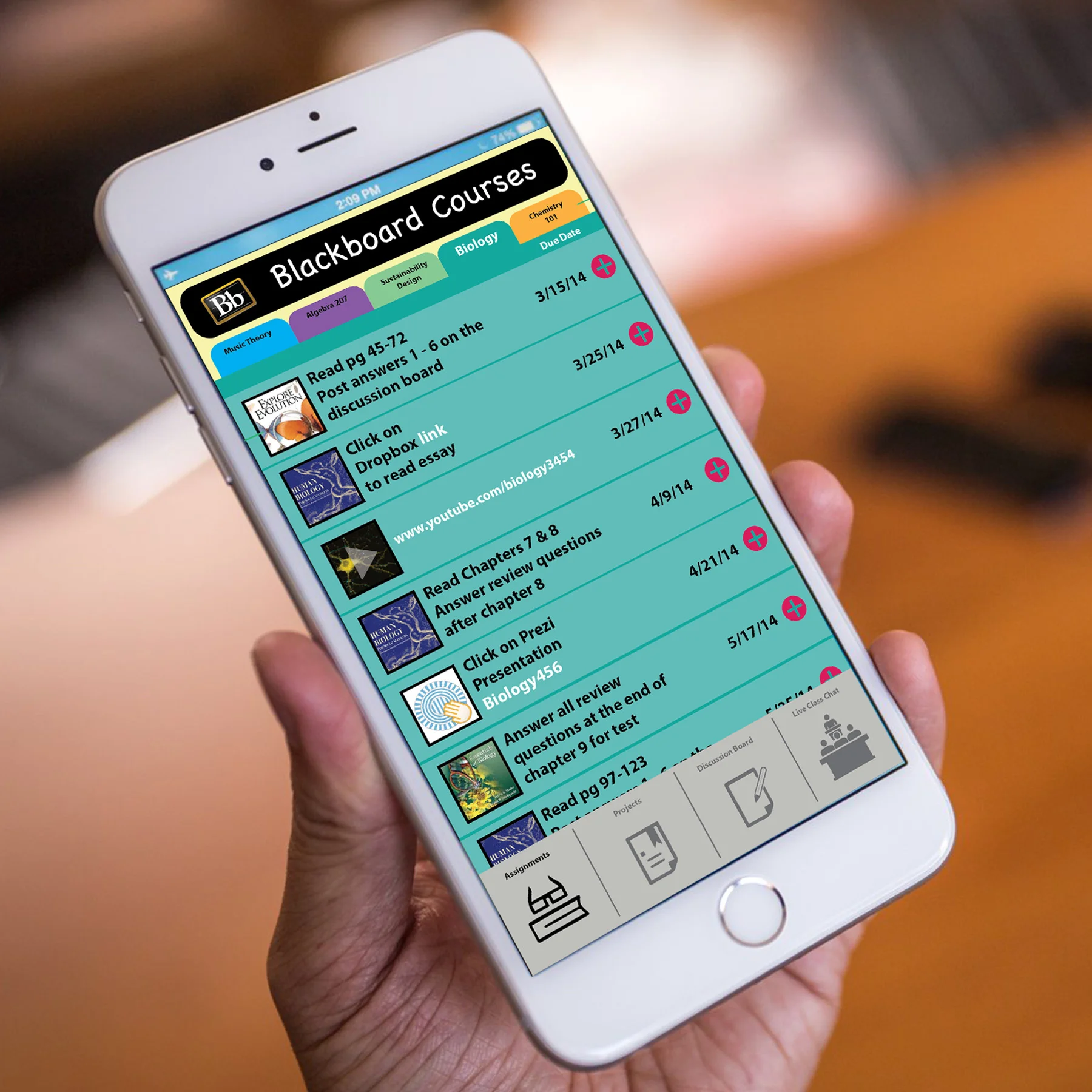
Mobile App Concept
Now users can learn on-the-go with the new Blackboard Mobile App. Users can now have a more simplified way to view assignments and jump between class projects and customize pages to how to help them learn most efficiently. This concept was a derivative from the web concept 02 ‘notebook divider’ (above) with the tabs across the top for easy class access on-the-go. This exercise was designed using Adobe Photoshop and Illustrator.